Popover using SwiftUI only
Today we will be focusing on presenting Popover using SwiftUI framework. Popover is a very common, simple and beautifull system UI element. With the only one downside - on compact size iPhone it will be presented as Sheet. In a most cases it’s not what developer, designer and product manager needs. In order to present Popover as small view, we can choose from bunch of options:
- Minimum deployment target iOS 16.4 and we are good to go already
- UIKit using
UIPopoverPresentationControllerDelegateand of courseUIViewRepresentable - 3rd party library that implements Popover like view and available via SPM
- Own implementation
Let’s deep dive into each possible case
- If you are lucky enough (or it’s already year 2025) and can use minimum deployment target iOS 16.4 (released in March 21, 2023), than just apply
presentationCompactAdaptationView modifier like so:
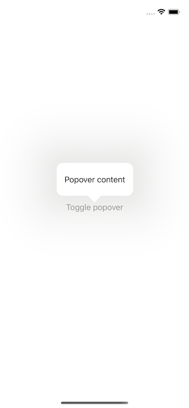
struct ContentView: View {
    @State private var isPresenting: Bool = false

    var body: some View {
        Button("Toggle popover") {
            isPresenting.toggle()
        }
        .popover(isPresented: $isPresenting) {
            Text("Popover content")
                .padding()
                .presentationCompactAdaptation(.popover)
        }
    }
}
Output is:
- Taking a lifebuoy in a face of UIKit may be not acceptable if your ultimate goal is multi platform SwiftUI app
- At the time of creating this article, there were no any 3rd party library which will not use
UIWindowor some other UIKit helpers - Own implementation may be time consuming and error prone while dealing with edge cases.
Goal of this post is to give a starting point of making own implementation. This time we will focus more on logic to display popup attached to source view, rather than replicating of Popover UI and placement configuration. First of all, let’s agree with therms:
- source view - is a view to which Popover should be visually attached. In the above code it’s
Button("Toggle popover") - popover view - is a view content of Popoover itself. In the above code it’s
Text("Popover content")
The brutal force approach would be to try using GeometryReader in order to get coordinates of source view in global space. Than using ZStack with source view in bacgkround and popover view with custom frame placing on top. Just like this:
struct ContentView: View {
    @State private var isPresenting: Bool = false
    @State private var sourceViewFrame: CGRect = .zero

    var body: some View {
        ZStack(alignment: .bottomLeading) {
            Button("Toggle popover") {
                isPresenting.toggle()
            }

            if isPresenting {
                Text("Popover content")
                    .offset(x: sourceViewFrame.origin.x, y: -sourceViewFrame.size.height - 40)
            }
        }
    }
}

extension View {
    func bindFrame(to frame: Binding<CGRect>) -> some View {
        background(
            GeometryReader { proxy in
                Color.clear
                    .onAppear {
                        frame.wrappedValue = proxy.frame(in: .global)
                    }
            }
        )
    }
}
Output is:
It’s really simple and clean solution. May be except of one tiny thing named… ZStack. Since it can screw up your intention of nested views layout in a very unexpected and not obvious way and not obvious moment of other UI code change.
Another approach would be to use .overlay View modifier. Wait, you may say that .overlay can’t show view that is bigger than source view. That is the big difference between using ZStack and .overlay, and that is a reson why we were using ZStack at a first place. That’s right…almost. In fact, if we will think out of bounds and apply .frame View mofifier to the popover view, SwiftUI engine will actually do the correct thing. In that case, app don’t need to calculate and manually use position of popover view, which in fact in terms of SwiftUI is just other, visually unrelated view. Instead, app can leverage system implementation and always show popover view visually attached to the source view.
This time there is another challenge - app need to know actual size of popover view. In order to achieve this, let’s create another one View modifier. Here is full code:
struct ContentView: View {
    @State private var isPresenting: Bool = false
    @State private var popoverViewSize: CGSize = .zero

    var body: some View {
        NavigationView {
            sourceView
                .overlay {
                    if isPresenting {
                        popoverView
                            .frame(width: popoverViewSize.width, height: popoverViewSize.height)
                            .position(x: popoverViewSize.width / 2, y: -16)
                    }
                }
        }
        .bindViewSize(to: $popoverViewSize) {
            popoverView
        }
    }

    private var sourceView: some View {
        Button("Toggle popover") {
            isPresenting.toggle()
        }
    }

    private var popoverView: some View {
        Text("Popover content")
    }
}

extension View {
    func bindViewSize<V: View>(to size: Binding<CGSize>, target view: @escaping () -> V) -> some View {
        modifier(
            ViewSizeReader(size: size, view: view)
        )
    }
}

struct ViewSizeReader<V: View>: ViewModifier {
    let size: Binding<CGSize>
    let view: () -> V

    func body(content: Content) -> some View {
        content.overlay {
            view()
                .background(
                    GeometryReader { proxy in
                        Color.clear
                            .onAppear {
                                size.wrappedValue = proxy.size
                            }
                    }
                )
                .hidden()
        }
    }
}
This View modifier creates an hidden overlay with a popup view and reads it size via GeometryReader embedded as .background (otherwise it will screw up the view layout). Than this size info will be used via Binding in order to set a frame size of the actual popover view.
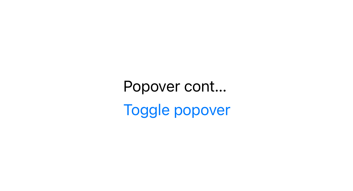
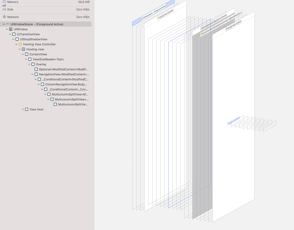
One very important note here. Since, as we know, .overlay by default can’t show view that is bigger from source view, ViewSizeReader View modifier should be attached to a view, that is big enough to host popup view through it’s hidden .overlay. In this case it’s NavigationView. Otherwise, if .bindViewSize will be attached to the source view, which is smaller than popup view, popup view will have maximum width and height of source view. That may be not enough to display whole content of popover view. Just like this:
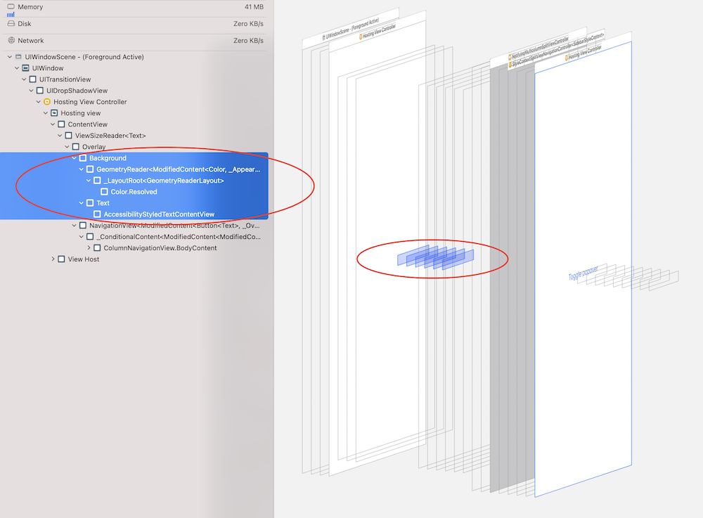
Now we are in safe - not a metter how complex wrapping content view will be, we will never screw up layout by using ZStack or top level GeometryReader under the hood. But how about to go even further? Currently, no matter if app is displaying popover view(s), there always be hidden “ghost popover” views added to the view hierarchy. Let me shot how it looks:
In order to avoid having extra views in a view hierarchy, app should use hidden “ghost popover” view to obtain it’s size only when user actually need to see specific popover view. Easy task to add isActive: Bool parameter to both func bindViewSize and struct ViewSizeReader in order to conditionally show “ghost” overlay. Much better:
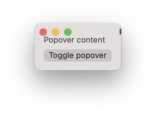
As a desired bonus, it’s full SwiftUI based approach, which means it will just work for any supported platform, for any orientation and size constraint. Just take a look at this neat macOS view:
Thanks for reading.
Source code
You can find complete project on GitHub targeting macOS and iOS platforms.